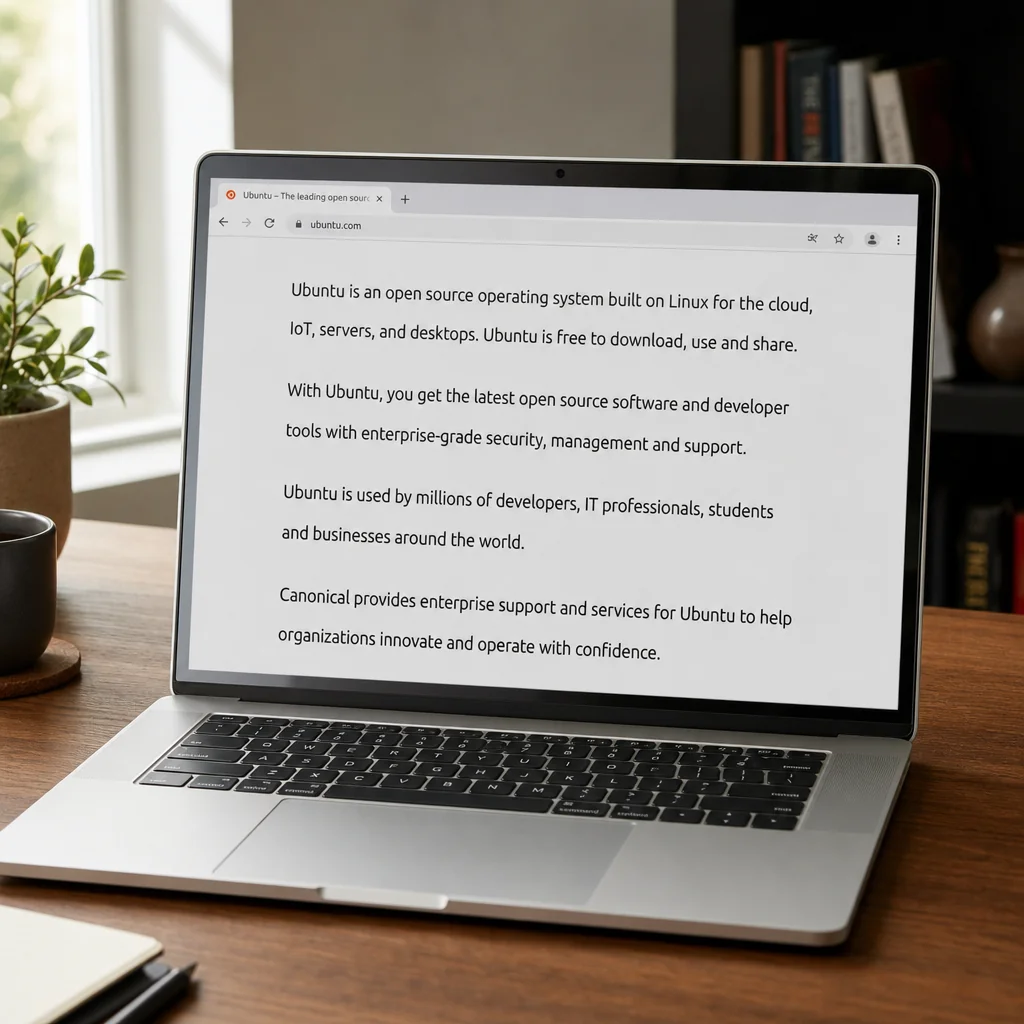
Typography is the silent partner of every successful blog. The right combination of typefaces, sizes, and spacing can make your content feel inviting, while poor choices can push readers away. In this post we’ll break down the fundamentals of typography and show how they’re applied on the Ravera blog, which uses Montserrat for headings and Helvetica/Arial for body copy.
1. Choose Complementary Font Families
Pair a distinctive heading font with a highly readable body font. Montserrat, a geometric sans‑serif, offers strong visual impact for titles, while Helvetica/Arial keeps paragraphs clean and legible. Avoid mixing more than two families to maintain visual cohesion.
2. Set Appropriate Font Sizes and Hierarchy
- Headings (h2, h3): Use a scale of 1.5–1.8 em for h2 and 1.25–1.4 em for h3 to guide the eye.
- Body text: Keep it between 16‑18 px (1 em) for optimal readability on desktop and mobile.
- Captions and meta: Slightly smaller (14‑15 px) to differentiate from main content.
3. Optimize Line Height and Letter Spacing
Line height (leading) should be roughly 1.4–1.6 times the font size. For a 16 px body font, set line-height: 1.5. Letter spacing for headings can be a touch tighter (‑0.5 px) to sharpen the look, while body text often benefits from normal spacing.
4. Use Contrast Effectively
The Ravera site employs dark gray text on a white background, delivering high contrast without harshness. Ensure color contrast meets WCAG AA standards (minimum 4.5:1 for normal text). For links, the accent blue provides a clear visual cue without breaking the overall palette.
5. Leverage White Space
Generous vertical padding (py‑16 and py‑20) separates sections and makes scanning easier. The 4 px spacing unit underpins consistent gaps across the layout, reinforcing a clean aesthetic.
6. Responsive Typography
On smaller screens the two‑column layout collapses, and font sizes should shrink proportionally. Use media queries to adjust heading sizes, e.g., @media (max-width: 600px) { h2 { font-size: 1.3em; } }.
Putting It All Together
When you combine thoughtful font pairing, clear hierarchy, proper spacing, and sufficient contrast, you create a reading experience that feels effortless. Readers stay longer, share more, and are more likely to subscribe to your newsletter.
Quick Checklist for Blog Typography
- ✔️ Use no more than two font families.
- ✔️ Maintain a clear size hierarchy between headings and body text.
- ✔️ Set line height to 1.5 × font size.
- ✔️ Ensure color contrast meets accessibility standards.
- ✔️ Apply consistent spacing using the 4 px unit.
- ✔️ Test readability on multiple devices.
Implement these principles today and watch your blog’s readability—and engagement—rise.